Is there a prize for the worst user interface to decline website tracking cookies?
I have a contender: Bain Capital Insurance (private equity investors in US for-profit healthcare plans)
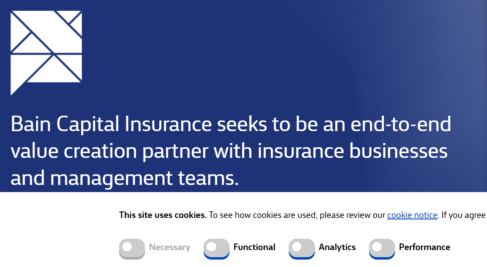
When you access the website (www.baincapitalinsurance[.]com) you see four toggle buttons, all toggled to the RIGHT - one shaded (Necessary) and three in bright blue (Functional, Analytics, Performance). So far, so good.
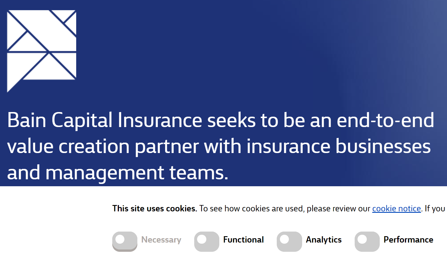
BUT, if you don't toggle those buttons off right away and instead scroll down the page as I did, the three buttons that were bright blue transform into gray buttons with tiny blue drop shadows, all toggled to the LEFT. They are all still toggled on.
Inattentive visitors to this website may assume they have toggled off the tracking since they are now all gray and the toggles moved from right to left.
If you click on the now-gray buttons, the toggles don't move. Instead, the drop shadows disappear.
This is deceptive and should be illegal in the US. I am not surprised that a predatory private equity firm profiting from a portfolio of predatory Affordable Care Act for-profit insurance providers would employ such a scheme. It is despicable in every aspect.


